The Oak & Ember
Back to Work
The Oak & Ember
Restaurant Website RedesignCreating a modern digital experience for a local restaurant through thoughtful storytelling, intuitive navigation, and mobile-first design.
View Project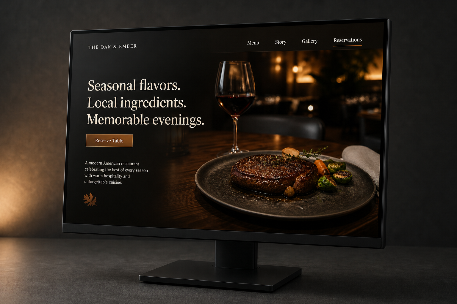
Project Overview
A family-run American restaurant in Portland, Oregon, serving its neighborhood for eleven years. The menu lived inside a PDF that mobile guests had to download and pinch-zoom, while busy Friday reservation calls often went unanswered and became lost tables.
The Challenge
The restaurant already had a story worth visiting. Its website simply was not telling it.
The Oak & EmberNEIGHBORHOOD AMERICAN KITCHEN
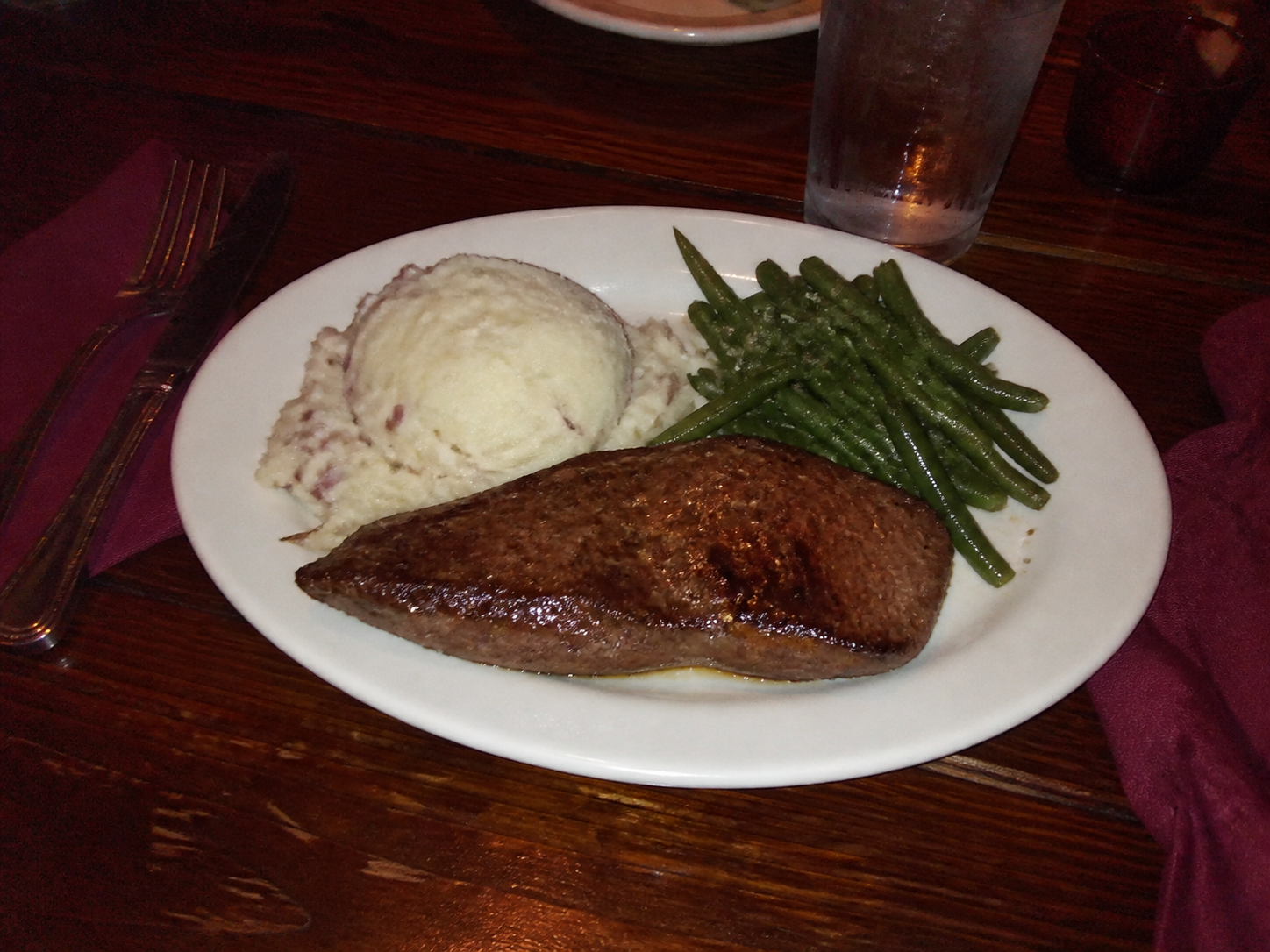
Welcome
Family-run American cooking, seasonal ingredients, and warm neighborhood hospitality since 2014.
Uploaded from mobileDINNER MENU
NEIGHBORHOOD AMERICAN KITCHEN
STARTERS
Soup of the day 7
House salad 8
Roasted mushrooms 10
ENTRÉES
Grilled chicken 18
Oak-fired steak 26
Seasonal pasta 17
- 01
Old website structure
A dated information hierarchy made the restaurant feel less considered than the experience it offered.
- 02
Menu hidden inside PDF
Guests had to download and pinch-zoom a document just to understand what was being served.
- 03
Weak visual storytelling
The food, atmosphere, and family-run character had no meaningful place in the experience.
- 04
Poor mobile experience
Small type, narrow layouts, and buried actions created friction on the device guests used most.
- 05
No clear reservation path
Visitors could browse the site without ever finding a confident next step.
From Information Website to Digital Dining Experience
The redesign reframed the website as the restaurant’s digital front door: useful first, atmospheric throughout.
01
Menu First
Put the menu and seasonal highlights within immediate reach, without downloads or dead ends.
02
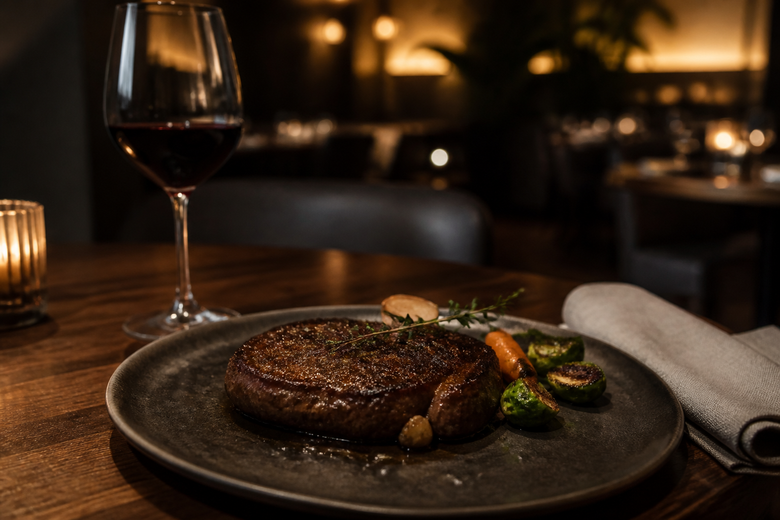
Visual Storytelling
Use intentional photography to communicate warmth, craft, and the feeling of an evening at the restaurant.
03
Mobile Experience
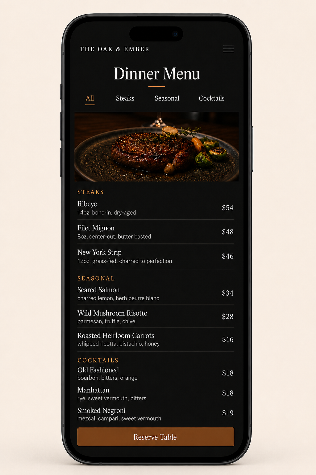
Redesign the journey around quick scanning, touch-safe actions, and a reservation path that stays visible.
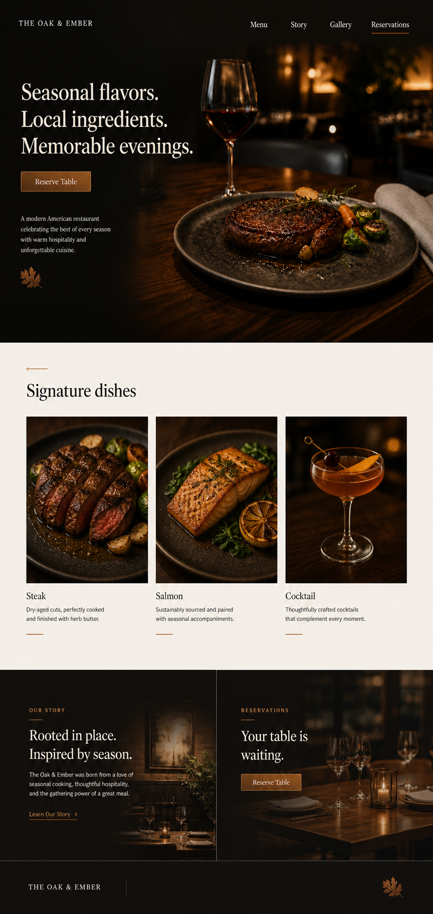
Homepage Design
A confident first impression, a clear reservation action, and a menu preview that turns browsing into anticipation.
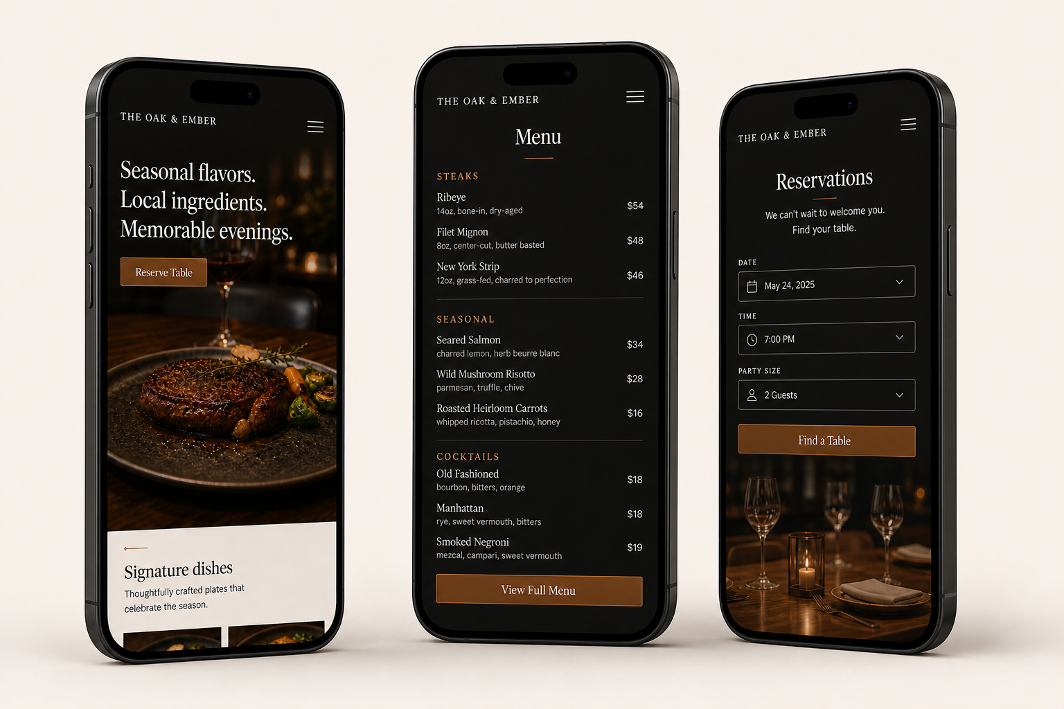
Mobile Responsive
Homepage, menu, and reservation journeys designed as native mobile compositions—not compressed desktop screens.
Visual Design System
A compact system pairs restaurant warmth with the precision needed for fast, confident decisions.
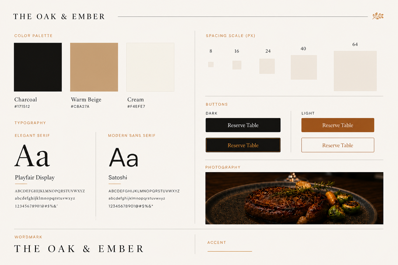
Colors
Charcoal, warm beige, and cream create a restrained palette with a quiet sense of hospitality.
Typography
An elegant serif carries atmosphere while a modern sans serif keeps navigation and details clear.
UI Components
Buttons, menu rows, and reservation controls share one precise, confident interaction language.
Spacing
An 8 / 16 / 24 / 40 / 64 rhythm gives each content layer room to breathe.
A website designed to help guests discover, trust, and experience the restaurant before they arrive.
“We'd had the same website since 2014. Aidi didn't just make it look better — she put our menu online and suddenly people weren't calling us five times a night asking what we serve. Reservations on Friday are up nearly half.”
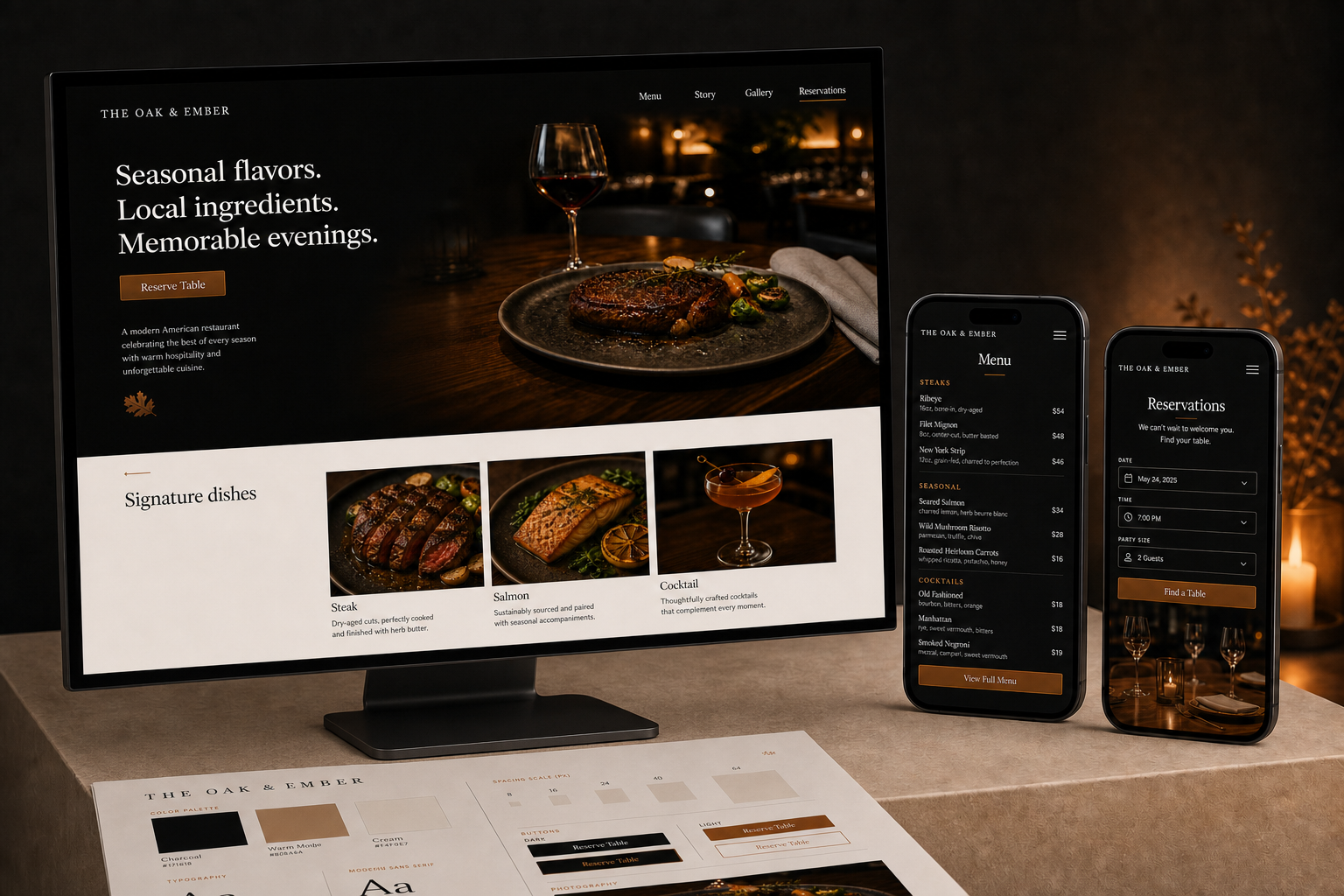
Designer Reflection
The redesign moved the restaurant beyond a basic information site and made the digital experience part of the visit itself. Clearer navigation, a mobile-friendly menu, stronger visual storytelling, and a direct reservation path now support the way guests actually decide where to dine.